![]()
![]()
![]()
![]()
![]()
![]()
![]()
![]()
![]()
![]()
![]()
![]()
![]()
![]()
![]()
![]()
![]()
![]()
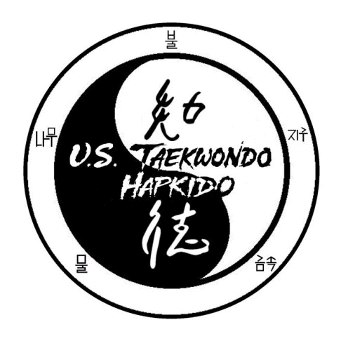
The logo represents our direction, which is to teach the original techniques and applications as they may have been in the past or at least as close as we can (since much of this information is lost). Emphasis in this school has been and always will be self defense. It is my belief that if you focus only on sport applications, that it will not translate well on the street because you cannot incorporate something that you don't know. However if you focus on street applications you can tone it down in the sparring ring.
The logo is rich with symbolism. You will notice that both Chinese and Korean writings are being used. This is to represent the link between the past and the present. Koreans used to write in Chinese, I have heard it referred to as the ancient or old writing method. The symbols in the outer circle are current Korean characters representing the five elements. This symbol at the top of the logo represents fire and going in a clockwise direction the next symbol is earth, next is metal, then water and finally wood. These 5 elements illustrate something referred to as the creative and destructive cycles. The two Chinese characters in the yin/yang represent THE WAY which is to use your knowledge and power to create harmony in everything that you do. The top one in black is knowledge, the bottom white one is power and harmony is represented by the yin yang. You could study the philosophies behind the various elements of the logo for a very long time and never come to a conclusion.